Art
James McNeill Whistler
Tate Britain, London
4/5
Nocturnes first and foremost
Whistler always seemed a bit hit and miss to me. Some of his mature works such as the Nocturnes, are outstanding in their atmospheric meeting of water and air at twilight, but other paintings can appear indifferent. In this large review of his work at the Tate Britain, we learn that it took him a while to find his distinctive style, inspired by Eastern influences such as the Japanese prints, which disturbed the Victorians with their unconventional placement of meaning. Despite his reputation for developing a different modern and non-sentimental aesthetic against the 19th century practices, some of his output still appears today rather decorative and saccharine. Nevertheless, it is revelatory to see such a large number of his works together to be able to enjoy his masterpieces and understand their origins, and also spot some lesser-known gems, particularly among his prints.
In the Arrangement in black and brown: the fur jacket (1877), the title says is all. The interest is in the wonderful textures of clothing in black and brown with the face of the model only there as a compositional contrast. Whistler manages to find sufficient nuance of distinction between very close colours for the painting to function as an assessment of textures and volumes, a strategy which he will successfully continue to explore in later works.
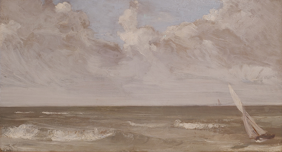
The breakthrough away from classical painting is clear in the beautiful Green and grey, Channel (the sea) from 1865. Water has been a great inspiration for Whistler and often the subject of his best works. The composition is artfully arranged, the leaning sailboat with delicate translucent sails on the edge providing some needed diagonal punctuation.
This exhibition also lets us discover many prints, mostly etchings, demonstrating a different parallel development to oils. Here we see a different side of artists’ personality, less showy and more self-contained. Where in oils Whistler sought to dissolve the lines and colours atmospherically, in prints the line is essential to the composition, although it progressively becomes part of more complex shading structures intent on depicting volume, perspective and ambiance. Having previously seen some of Whistler’s prints only in reproduction, it is surprising to note how small they are, like Victorian miniatures.
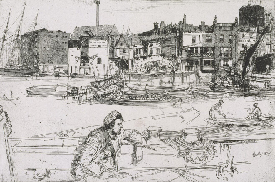
From his print output on view, mostly from the V&A, we can see many depictions of the working London docklands such as Black Lion Wharf (1859), which today appear wistfully industrial. It is fascinating how this American painter understood the dirty old Thames and depicted it with such emotional affinity.
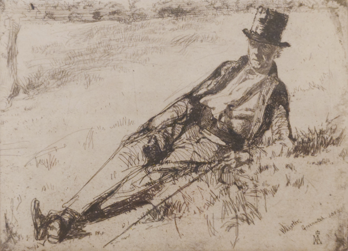
Among the early London etchings there are some wonderful portraits. The one of Whistler’s niece Annie Haden from 1860 is a great example of the supremacy of line. The young girl’s cloak and full skirt form a pyramid of lines on a background of vertical curtain lines, interrupted only by the girl’s round hat at the top and the swirly rug pattern at the bottom. Annie looks like Alice in Wonderland, poised to embark on an adventure, captured in a woodland of lines. By contrast the Greenwich pensioner from 1859, a tiny humble work, shows a man lying on a bank. His nonchalant diagonal posture accentuated by the parallel cane gives this etching its secret dynamism.
Tate recreates The Peacock Room (1876–1877), the artists’ only surviving decorative interior which is on permanent view at the Freer Gallery of Art in Washington DC. Reminiscent of Frederick Leighton’s Arab Hall which was competed only a few years later, this space combines on its dark walls blue-and-white Eastern ceramics on golden shelves with Whistler’s paintings and murals. The best part is the beautiful mural of two fighting peacocks in gold on a dark leather background, which Whistler entitled Art and Money to represent the conflict he had with Frederick Layland who originally commissioned the work. The golden stylised texture of peacock feathers is stylishly repeated in other sections of the wall. Tate pointlessly adds a loud audio of the Whistler’s disagreement with Layland which is annoying, but the gap between the automated replay is long enough for the visit, if timed well, to be enjoyed in peace.
It is a shame that the Tate didn’t manage to bring Purple and rose: the large leizen of the six marks from Philadelphia which would strengthen the case for the maturity of Whistler’s far eastern aesthetic dominating 19th century dainty sweetness. But we get Variations in violet and green instead from 1871, a vertical composition in Japanese style showing the width of the Thames with a corner of a garden in the foreground, a mild but interesting vision of Japan on Thames.
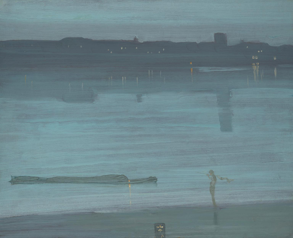
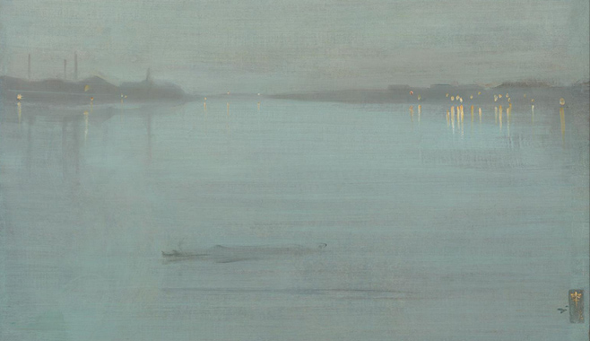
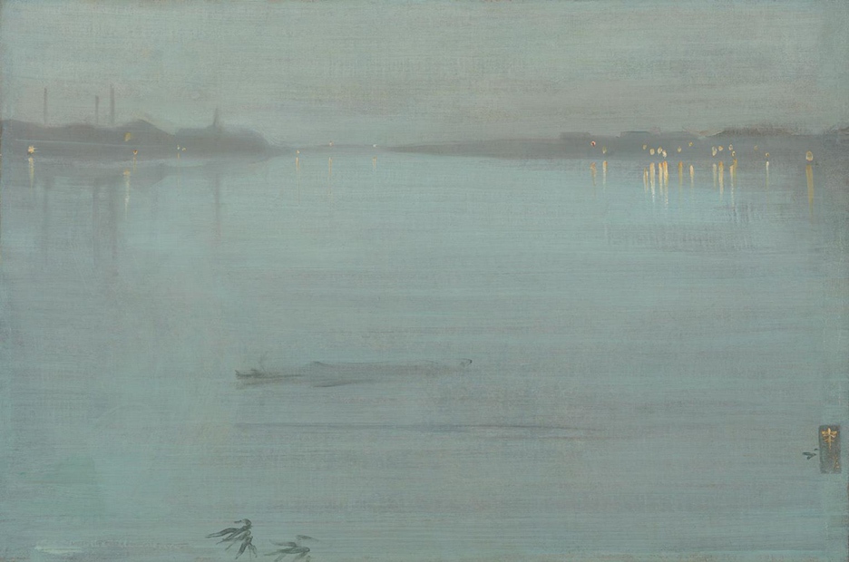
The highlight of the entire exhibition is a room dedicated to Whistler’s Nocturnes. They demonstrate in practice his statement printed on the wall: “Paint should not be applied thick. It should be like breath on the surface of a pane of glass.” The best three pieces are owned by British museums. One is of Venice from the National Museum of Wales: Nocturne: blue and gold – St Mark’s, Venice from 1879-80. The ghostly dissolution of St Mark’s at dusk is accompanied by an atmospheric Venetian blue sky. The two remaining ones are of Thames at twilight from the Tate collection, the water and the air a delightful horizontal blue with an occasional dot and reflection of light: Nocturne: blue and silver – Chelsea from 1871 and Nocturne: blue and silver – Cremorne lights from 1872.
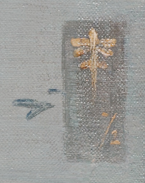
The Thames paintings feature Whistler’s stylised monogram stamp in far eastern style, in the shape of a butterfly, which the painter used to sign many paintings. It has been refined and simplified over the years and reached in the Nocturnes its most advanced calligraphic shape, inevitably in gold.