Art
Rothko in Florence
Palazzo Strozzi, Florence
5/5
Burning luminosity
The elegant tall windows of the Palazzo Strozzi reflect the sun in long bands of light on the floor at the feet of Rothko’s panels of colour.
Rothko’s work is opaque, abstracted to the maximum to denote essence. As such it can be difficult to name the mechanism by which it captivates, or to observe all its different layers of meaning. The striking luminosity of colour and the perfect proportions of the canvases and colour fields allow the viewer to temporarily immerse himself in acute visual passion which burns with uncommon abstracted intensity.
Rothko is unique in many ways. His flat colour field paintings which he is most famous for transcend their physical boundaries to give us a satisfyingly meditative portion of time.
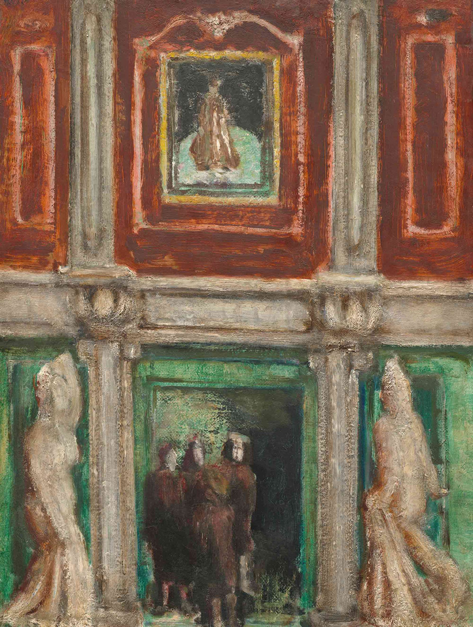
This exhibition proposes a connection between Rothko’s visual spirituality and the art he saw and absorbed in Florence. It draws our attention particularly to the influence of Fra Angelico and Michelangelo who provide spiritual and architectural models. There is no doubt that Rothko was inspired by the Florentine Renaissance, and there is one painting in particular which proves it more directly, a blurred Italianate interior equalising walls with figures, an interesting stepping stone on the road to abstraction, unclear in its purpose, a shorthand perhaps for the conflicting energies of people and spaces, indifferent to each other.
Rothko’s spirituality has no relationship with Christianity, except in a wide sense of its understanding of passion as also Christian while unquestionably secular. It is in essence an intellectual, artistic and universal sensitivity which appears authentic in the contemporary setting precisely because it has no basis in traditional religion.
I think sometimes that all of Rothko’s colour field works are in fact interiors, depictions of a carefully chosen space, which could be a prison but also the interior of the mind. It is Fra Angelico’s incidental depiction of space, in particular space dedicated to silence, that moved Rothko, not the thematic content of his works. If Rothko’s intention was to convert the meditative nature of Fra Angelico’s intensely religious frescoes into an abstract 20th century medium, then it must be said that he achieved this big leap. However the question is perhaps not whether he actively sought to enact this conversion, but how he succeeded in travelling so far. It is likely that Rothko had his destination in view already and the Florentine influence only made for a narrow although fertile tributary.
Rothko recognised in the Michelangelo’s Laurentian library the feeling of being trapped in a space or in one’s own body and transferred this sensation to his Seagram Murals where the light of the outside world puts pressure on the interior, which resists, calmly. The sketches for the Seagram Murals on view are surprisingly powerful even in their small scale. They confirm that Rothko’s vision for these works was clear. Whether you see them as the gates of hell, portals to the inner workings of depression, or abstract notation of passion for colour, space and life, they conquer your vision immediately.
Rothko’s son Christopher takes an active role in the curation of the exhibition. He and his sister Kate have lent several pieces from their large collections. The previous blockbuster exhibition of Rothko’s work in Paris in 2023 was also co-curated by Christopher Rothko, on a mission to promote a wider understanding of his father’s work. I don’t know how art historians feel about this generosity as it comes with some strings attached, but it is nevertheless commendable that Rothko’s descendants are willing to share.
Walking through the 10 rooms chronicling the painter’s work, we are first taken through the early experimentation with figurative and surrealist styles. A few small pictures containing human figures are puzzling and underwhelming. But even the greats have to find their way slowly, methodically going through the range of options.
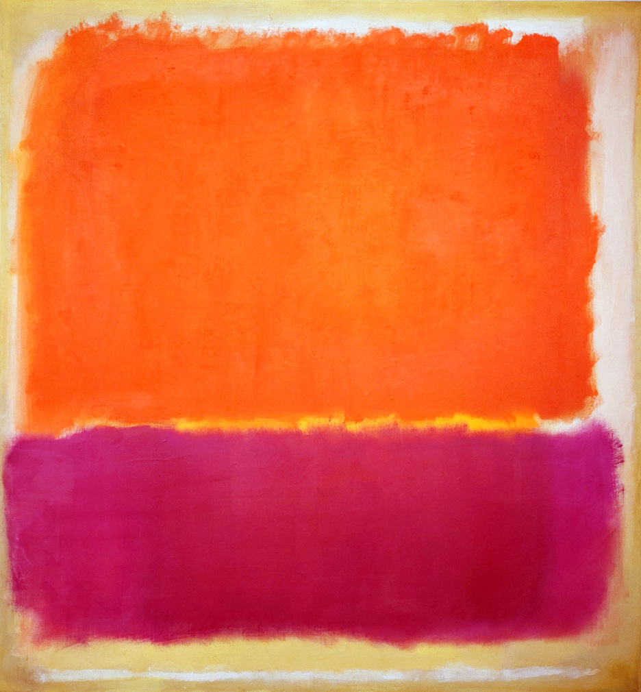
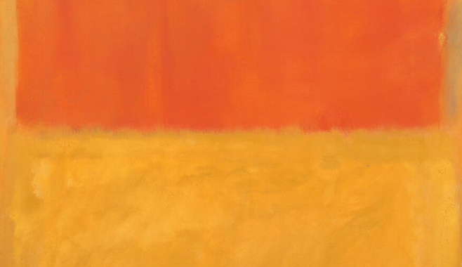
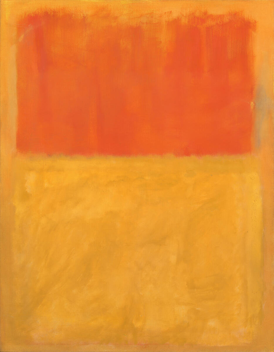
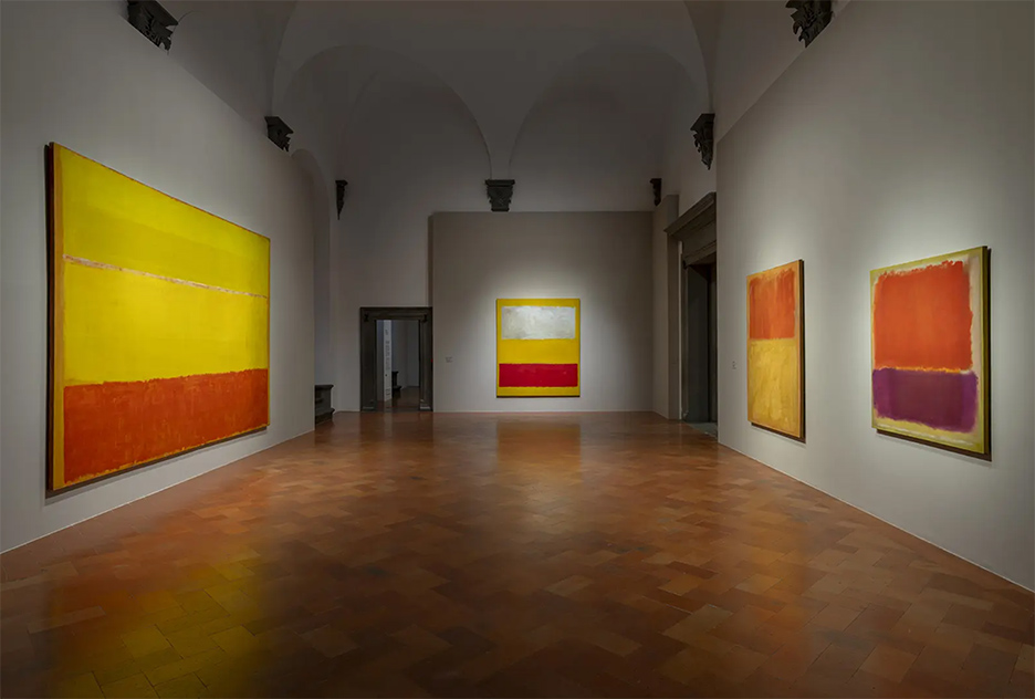
In a room of yellows, the most striking and the warmest are No. 12 from 1951 and Orange and tan from 1954, the fire burning gently in the bottom halves. They are joined by two additional predominantly yellow canvases from the same period, together saturating the space with exciting vibrant colours this observer would have liked to dwell in for a while. I only ask for a few months.
Despite the passion and radical unrest of these paintings, they are received as joyful acts of immersion in the universe and this is what separates Rothko from other abstract painters, this ability to pass endurance for colourful pleasure, to mask aching pain as joy which brings him closer to the Christian painters of the Quattrocento.
After the yellow room, comes a room of grey and black, shockingly flat in comparison. The crutch of the exuberant colour is removed and we see the scaffolding of life completely bare and dull. This also is painting of passion, Rothko makes sure we know.
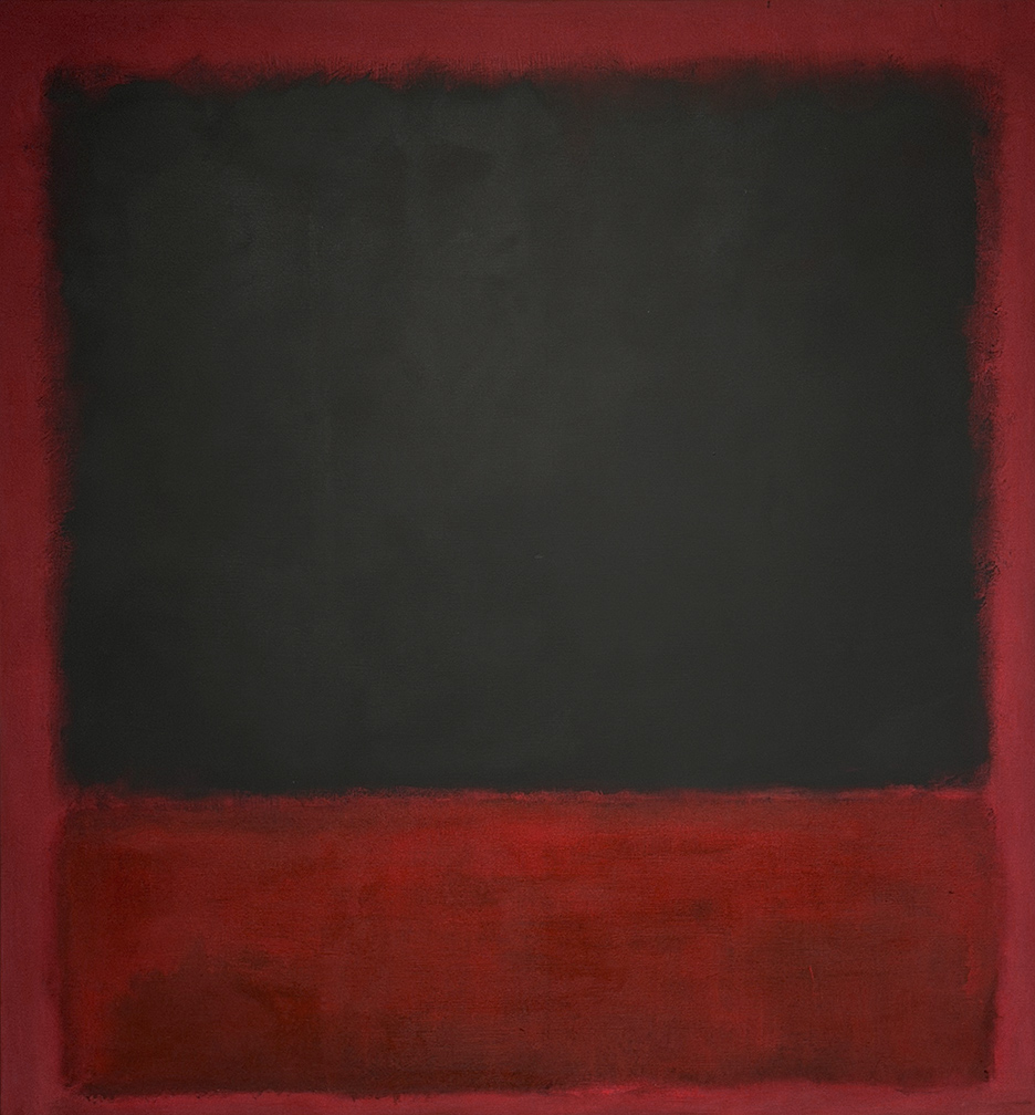
More than yellow, red is the colour Rothko is mostly associated with. The colour of Seagram Murals, the culmination of his oeuvre. His red is always rich, cardinal, always prettier and stronger than blood, whether veering towards orange or purple. His red is always stable, irreducible.
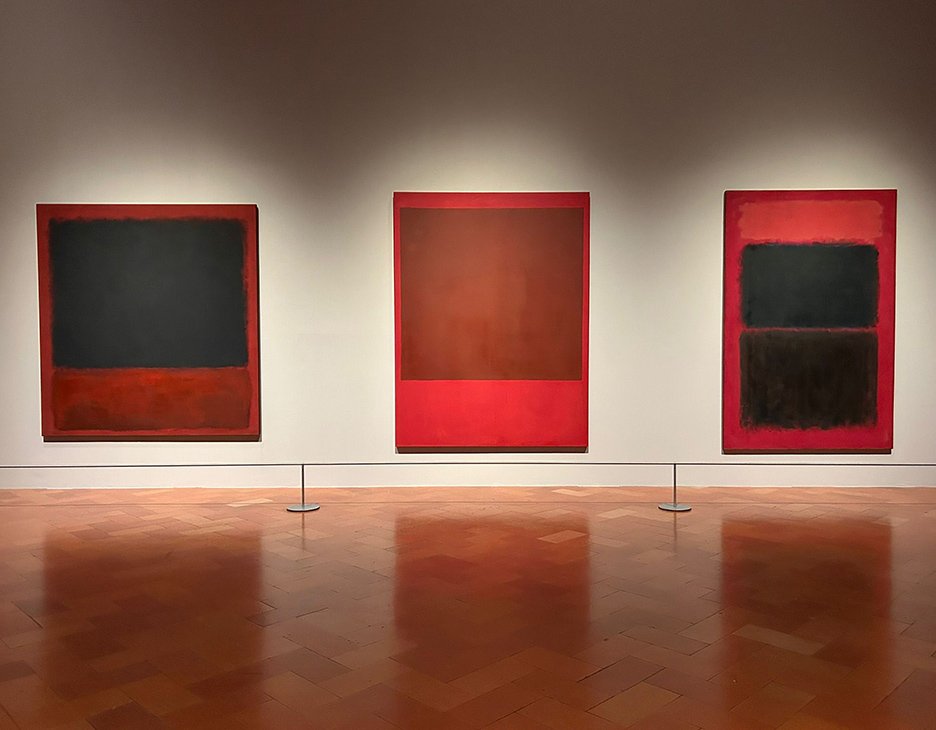
The elegant tidiness of the Untitled (Black, red over black on red) from Centre Pompidou in Paris communicates with the two variations of the same size placed alongside, a plainer one from Kate Rothko collection in the middle and a more complex and robust piece from Tate Modern on the right (Light red over black). The French painting seems strangely complete, the red and black as equal partners.
The paintings in the last room no longer reproduce the same sense of urgency. The colours and textures are calmer, more liquid. If this is a true representation of his last years of life, it is a sad loss of vital energy.
Similarly to Albers who repeated his ideal pattern of squares of colour, at the height of his powers Rothko most often uses the portrait format with two core rectangles of colour, often with the longer one on top. It is a successful configuration that he transforms considerably with variations of colour, texture and accent. Some of these variations stay with you with their luminosity, the vibrant shades of colour continuing to interact, and when they finally dissolve and fade from memory, the Rothko mood still remains, a meditative engagement with the world.