Art
Painting the French Riviera
The Royal Academy of Arts, London
3/5
Côte d’Azur seen by artists
The promise of sunny and vibrant art depicting the Côte d’Azur undoubtedly has an easy appeal. Many works satisfy expectations, but the overall quality of this large chronological display is diluted by the lack of a coherent thread and by inferior selection, too frequent to be simply thought of as a charming digression. There are too many paintings included just because their author lived by the sea even if they have no obvious pictorial connection to the Riviera. There are two rooms of average Picassos, and one large room of Fauvist and post-impressionist paintings without many stand-out examples. But once you reach the Matisses and the Bonnards, the balance slowly shifts.
It is interesting that most of the loans come from the US, and although American collections brim with masterpieces, we don’t get to see that many. You get the impression that it was hard work getting these loans and that they were often not the curator’s first choice. As a result, although there are nice surprises in places (Charles Camoin and William H. Johnson), and one can’t complain having a roomful of Matisses and Bonnards, and strong representation of de Staël and Klein, the overall effect is a little underwhelming.
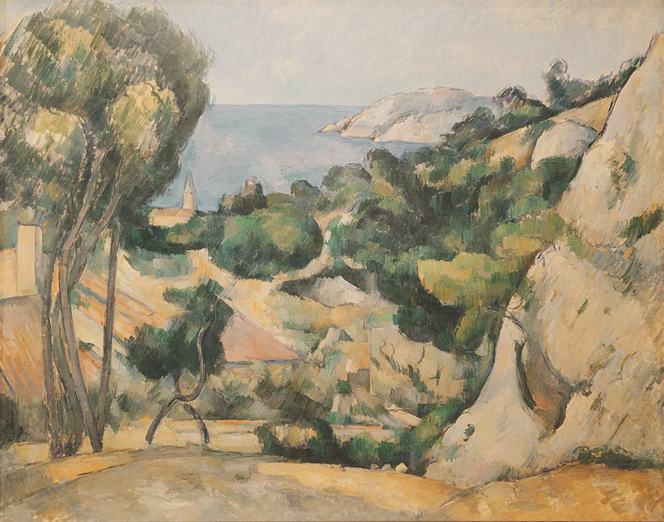
Cezanne’s L’Estaque from 1879-83 is the true beginning of this show. I’m always surprised anew by the painter’s unusual orderliness and precision. From the depths of the Provençal vegetation appears the view of the sea. It is not the destination that enchants, but what leads to it, the luxurious uneven vegetation surrounding the viewpoint.
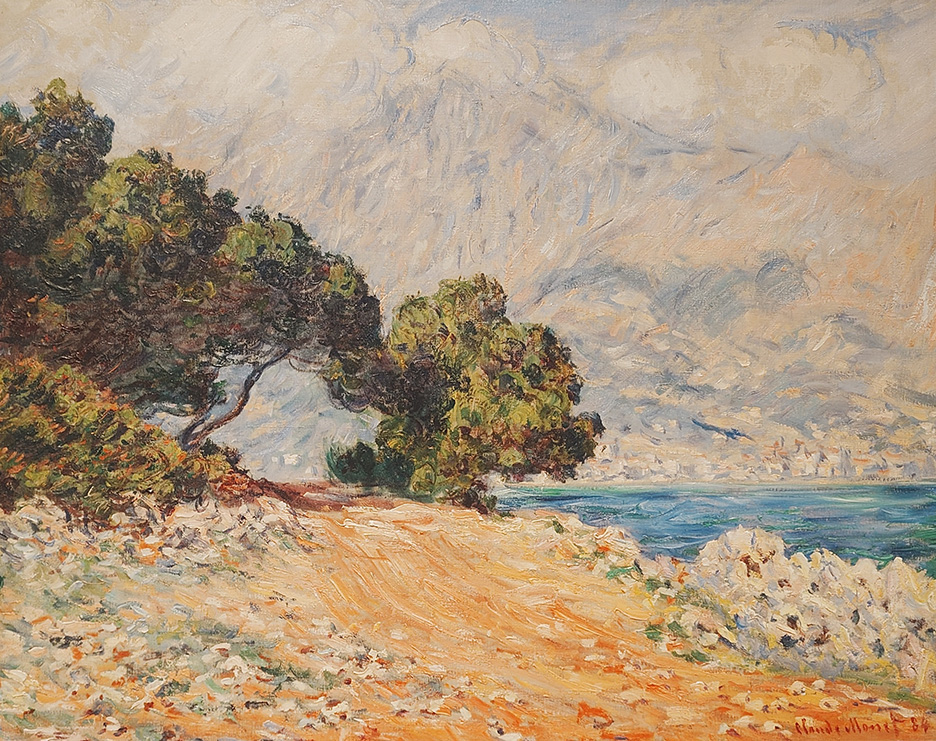
There are several Monets included, but Cap Martin, near Menton from 1884 offers the most captivating composition. The diagonals of the treeline, mountains and coast mirror while a gap in the slanted pine trees on the left centres on a single white rectangle in the distance, an anonymous dwelling where the eye can rest. The swirling brush patterns on the vegetation and the mountainside change direction and contrast with the horizontal brushwork on the sea. We begin to see the pattern of seascapes where the sea is merely glimpsed but is nevertheless the main character.
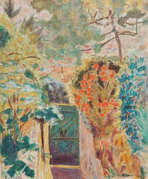
I think I must have heaved a sigh of relief upon entering the room with all the Bonnards. Although not the best selection of his work, here at last was the true substance of this exhibition. Gate at Le Bosquet in Le Cannet from 1944 is joyful in its colourful confusion of vigorous plants. The Palm from 1926 is extensively vibrant and satisfying despite its awkward contrast between Marthe’s grey bust in the shade holding an apple like a mythical Eve, and the colourful sunlit background. Also painted at Bonnard’s house Le Bosquet it demonstrates the painter’s deep engagement with the Mediterranean landscape. The Riviera from 1923 shows a glimpse of the azure sea across extensive, blue-tinged vegetation.
Out of several of Matisse’s interiors with a view of the sea from a window, it is Seated woman, back turned to the open window from c. 1922 that gives perhaps the most direct maritime experience with its wide view of the promenade in Nice next to the blue Med accompanied by the colourful interior in red tones. The boundary between the reds and the blues are the whites and pale yellows of the window frame and the pavement.
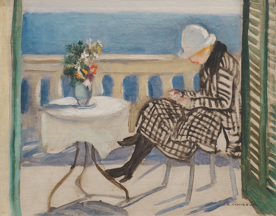
Good to see a nod given to John Duncan Fergusson, but again there are much more vibrant paintings that could have been chosen. Out of the lesser-known painters on show, it is Charles Camoin’s Lola on the terrace from 1920 that takes the prize with its atmospheric depiction of sun and wind on a Mediterranean terrace in winter. A woman sitting in a fashionable coat, with her back to the sun, is leaning to look at something in her hands. She could be reading a book. If this was painted today we would probably say that she is looking at her mobile phone.
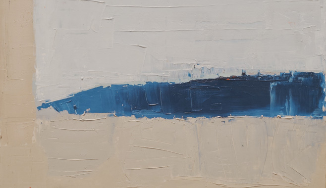
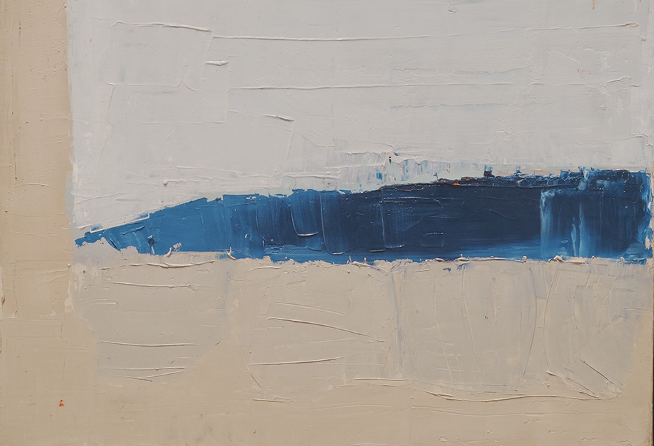
Last but not least, it was great to see Nicolas de Staël and Yves Klein included in this overview. In addition to extending the exhibition timeline to the 50s and 60s, these artists are rarely seen in the UK and have a highly authentic and original output. De Staël’s instinctive abstractions are meditative and suggestive, calm and fraught, simple and complex. His Le Fort Carré, Antibes from 1955, one of his last works before his early death, carries an overcast melancholy in its horizontally applied greys, whites and blues. Landscape from 1953 is perhaps the most abstract painting on show. Although not representative of the exhibition as a whole, it summarises succinctly the motif of a patch of sea in the background, often to the right, seen perhaps from a window, which gives meaning to the whole canvas.
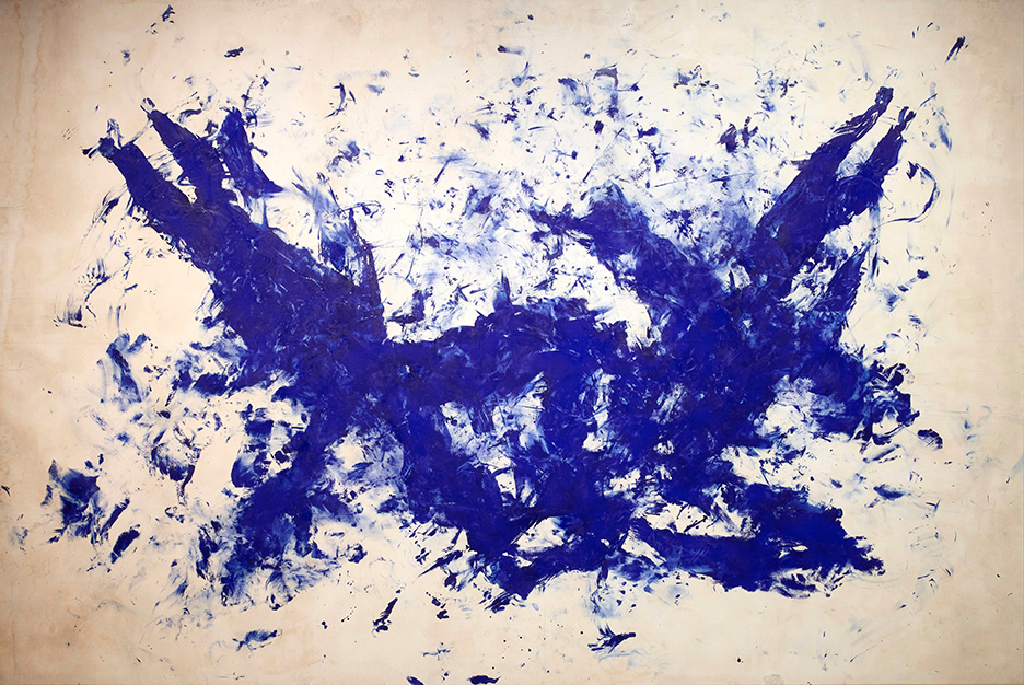
Klein’s works are also a shorthand for the presence of the Med. His International Klein Blue colour is in appearance such a simple invention, and yet you cannot fail to recognise a Klein due to its unique colour, style and restricted subject matter which always speaks of the sea. It’s either sea creature shapes, sirens, sea sponges or flat blue surfaces, and always in International Klein Blue. Klein may have seemed modish in the 60s, but his works have stood the test of time.
The last room features a baffling selection of vintage holiday posters where only a few deserve a place, and most puzzlingly a video of the Riviera from Hollywood films. A way to fill out the space it seems when no other paintings are available. However, in a small redemption, Matisse’s celebratory poster Nice: Work and Happiness (Nice, Travail et Joie) from 1947 next to Picasso’s Côte d’Azur from 1962, demonstrate an unforced comparison of values and aesthetics of these two greats.